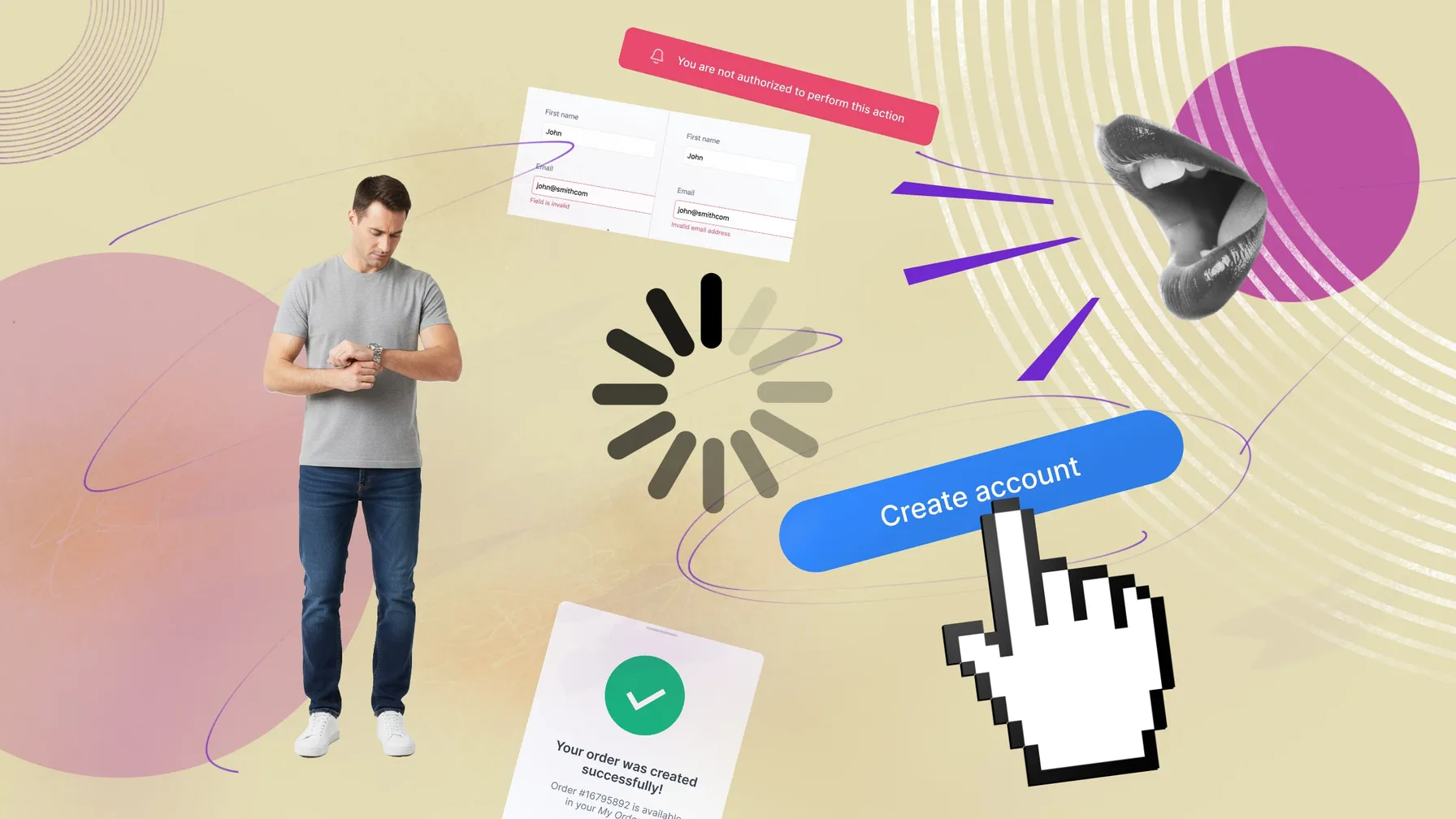
The Hidden UX Killers: Part 1 — The Silent Product
In the relentless pursuit of launching a Minimum Viable Product (MVP), we often find ourselves cutting corners on implementation. The rationale is simple: get it out fast, iterate later. But this speed-at-all-costs mentality can backfire, resulting in a product that, despite solving a real problem, nobody actually wants to use.
Users can forgive missing features — they can’t forgive confusion. And few things create more confusion than a product that simply refuses to communicate back.
Let’s start with the most common symptom of that silence: when your product gives no sign of life.
1. The Peril of Invisible Processes: Missing Loading States
Picture this: A user clicks a button, submits a form, or navigates to a new page. What happens next? Often, nothing discernible. They're left wondering: Did my click register? Is something loading? Or is the application simply broken?
This lack of feedback is a significant source of user frustration, leading to repeated clicks and a sense of helplessness.
This oversight typically stems from two main sources:
- The Designer's Blind Spot: Designers often think in clear, linear flows: click → success or click → fail. Their mental model doesn't always account for asynchronous web requests and the crucial waiting period in between.
- The Developer's Bubble: Developers work in ideal local environments, where everything responds instantly. They see requests in DevTools and assume it’s “obvious.” For real users on slow networks, that silence feels like a crash.
In reality, even a one-second pause without visual feedback can trigger the full “stages of grief”: denial, frustration, and resignation. Users may click the same button multiple times, creating duplicate requests or corrupted data.
The fix is simple:
- Show contextual feedback (disable the button, dim inputs, add a spinner).
- Prevent duplicate submissions.
- Use a consistent loading pattern across the app.
A reusable “loading state” component adds maybe 20–30 minutes of work per flow but pays off with dramatically higher perceived quality.
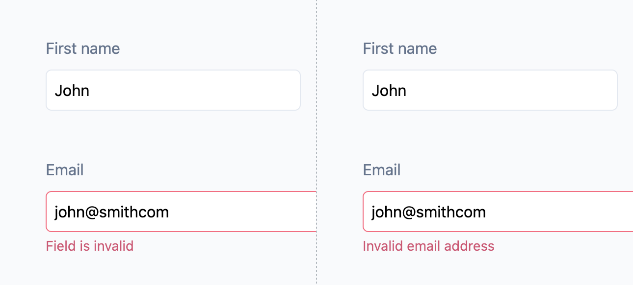
2. The Unhelpful Form: When Validation Is an Afterthought
In the worst-case scenario, developers only implement the happy path. The form accepts anything, sends it to the server, the backend throws a 400 Bad Request, and the user is left to solve this riddle alone.
A slightly better version checks for required fields — but that’s still a cartload of pain for anyone trying to use it.
Why does it happen?
In early startups, technical specs are often chaotic or nonexistent. Validation is considered “something to do later,” which usually means “never.” Developers also know exactly what should go into each field, so they don’t perceive the problem the same way users do.
How to fix it cheaply:
Invest a few initial hours into a proper form architecture. Use a common library (React Hook Form, Formik, VeeValidate) and wrap it with a small utility that handles boilerplate logic. It should:
- Receive a validation schema (Zod, Yup, Ajv).
- Run validation before sending any request.
- Show unified, human-friendly messages for common cases (required, number only, min/max, email, etc.).
This way, you can polish wording later — when a UX writer joins — without rewriting your forms.
If your backend is written in TypeScript, share the same schemas between client and server. It keeps everything in sync and dramatically reduces edge-case bugs.
Sure, it might take 10–15 hours upfront to setup, but the clarity and consistency it brings to your product’s UX will pay off every time someone hits "Submit."
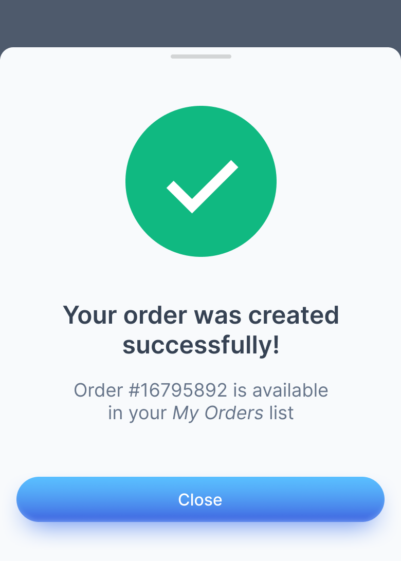
3. The Empty Silence: No Feedback After Actions
If I got a dollar every time a form submission failed and the only "response" appeared in the browser console, I’d be writing this from a beach somewhere.
It’s one of the most common oversights in MVPs: the product does process actions, but users never see any confirmation.
Did it work? Did it fail? Should I try again?
The silence creates frustration — even when the logic is perfectly fine.
Why it happens:
Designers and developers operate with insider knowledge. They know what’s happening behind the scenes. The user doesn’t. To them, every unacknowledged click feels like throwing data into the void. Even worse, developers don’t value the data in forms the same way users do — to them, it’s dummy text. For users, it’s their real work disappearing into uncertainty.
How to fix it:
Micro-animations are cool and can help indicate that something happened, but they’re too “expensive” for an MVP. Focus on something more affordable instead:
- For major actions, show a dedicated confirmation screen or success message.
- For smaller ones, use a toast, snackbar, or subtle inline message.
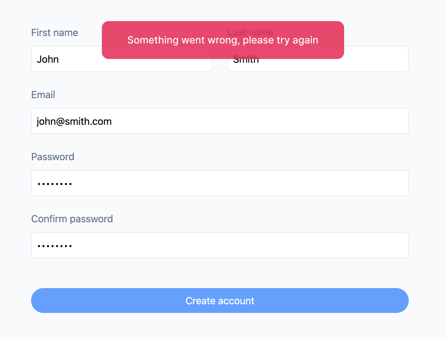
- Always handle server errors gracefully — even a simple “Something went wrong, please try again” is infinitely better than silence.
The goal isn’t to over-communicate. It’s to make users feel acknowledged.
4. The Cold Machine: Technical or Inhuman Error Messages
Errors are inevitable. But cold, cryptic messages make them feel like punishment.
Messages like: Error 422: Unprocessable Entity or Invalid token may make perfect sense to a developer — but to users, they read as: "you did something wrong and we don’t care."
A better message acknowledges what happened and helps them recover:
✅ "Your session expired — please log in again."
✅ "That file’s a bit heavy! Try something under 10 MB."
Why it matters: Language shapes perception. Even a small touch of empathy turns frustration into understanding. You don’t need a UX writer for that — just consistency and a human tone.
Pro tip: keep a small dictionary of reusable messages across your app. It ensures consistency and makes later localization or tone adjustments effortless.
Closing Thoughts
Every example above comes down to one root issue — silence.
Users don’t abandon MVPs because they lack features. They leave because they can’t tell if the product heard them.
Communication isn’t a luxury — it’s the minimum viable trust.
Your MVP doesn’t need to be perfect. It just needs to talk back.